
Crafting the Perfect Cannabis Logo: A Creative Guide
A compelling brand identity roots itself in a logo, the visual whisper of your company’s essence. As the cannabis industry flourishes, creating a logo that captures the spirit of your brand while respecting the iconic leaf becomes a delicate dance of creativity and strategy. Effective design beckons customers, carving out a distinct presence in both physical and web design landscapes. With the right information and some creative zest, you can design a logo that not just exists but resonates. Keep an eye out as I walk you through the nuances of fashioning a logo that embodies the essence of your cannabis brand, ensuring it stands out in an ever-growing marketplace.
Understanding the Essentials of a Cannabis Logo

Embarking on the journey to create a cannabis logo, designers must consider the confluence of aesthetics and meaning to craft an image that truly resonates with the target audience. Among the essentials, the green color schemes stand out as a tribute to the plant‘s natural essence and its connection to growth and vitality. More than just a color, green in the logo also affirms the brand‘s commitment to organic and eco-friendly ethos. Pushing the boundaries further, leaf motifs are not just expected iconography but a necessity for symbolizing nature and authenticity within the cannabis industry. A logo should serve as a peaceful vector graphic that invites onlookers into a state of tranquility, achieving this through thoughtful design elements that evoke calm and comfort. However, striking the right balance between boldness and simplicity ensures the symbol does not overwhelm but rather, captivates. And in a world where social media platforms like TikTok rapidly shape brand perception, a well-designed logo can transcend the traditional, becoming a seamless part of the visual dialogue in digital spaces.
The Significance of Green Color Schemes
When I approach the art of logo creation, especially within the cannabis industry, the selection of green hues goes beyond a simple aesthetic choice—it’s strategic for search engine optimization. Green not only symbolizes the freshness and vitality of the plant but also sets an easily recognizable visual for users scanning through digital content, making a well-designed green logo more likely to stand out in search outcomes.
In pursuing excellence in graphic design, the harmonious coupling of green’s multiple shades with the logo‘s shape and typography defines a brand’s unique character. This careful deliberation in the design process ensures that the resulting emblem commands attention, resonates with viewers, and fosters memorable connections—a must in the increasingly saturated marketplace.
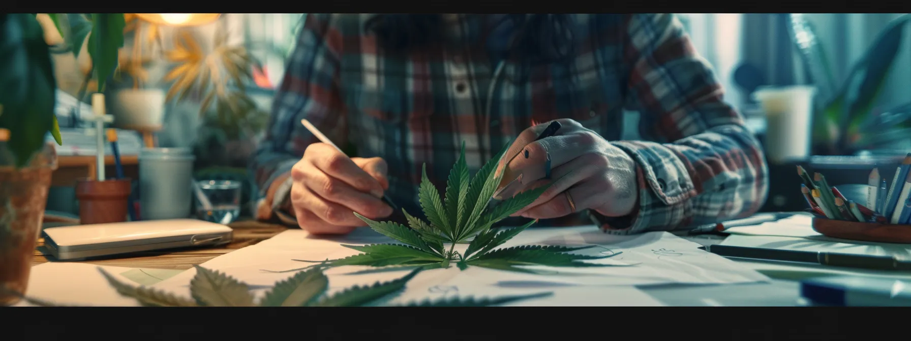
Symbolizing Nature With Leaf Motifs
Integrating leaf motifs into cannabis logo design is one of my favorites for its power to represent the natural origins of the product. Just as anime characters often have distinctive insignias to set them apart, a cannabis logo thrives on an iconic leaf shape that captures the essence and purity of the plant while appealing to a discerning clientele.
The concept of nature in cannabis logo graphics is elevated by the very shape of the leaf, which can be stylized to mirror plumes of smoke, imparting movement and an almost ethereal quality. This subtle nod not only aligns with the product’s use but also reinforces a brand’s narrative of organic authenticity and quality in a single, memorable emblem.
Incorporating the Element of Tranquility
Creating tranquility in a cannabis logo reflects an understanding that consumers often seek a serene escape within their purchases. By designing a logo that encapsulates a reassuring space, it instills a sense of peace, encouraging clients to envision the calming effects of the plant before they even experience it.
I believe in the notion that every element of a brand, down to the email signature, should radiate harmony. Thus, when adding a touch of tranquility to a cannabis brand‘s identity, it becomes more than a symbol; it’s an invitation to a soothing experience, whether in retail environments or when exploring an FAQ section online.
Balancing Boldness With Simplicity
Boldness in a cannabis logo does wonders for Instagram and other social channels where vivacity catches eyes; yet, it’s the judicious use of negative space that often turns a standard logo into a banner for health and wellness. A powerful visual must be as approachable on a billboard as it is on a business card, resonating across diverse marketing channels without losing its impact.
My professional commitment to simplicity means distilling a design down to its essence without forfeiting the bold statement a cannabis company must make. This philosophy shapes logos that speak volumes through minimalist lines and forms, ensuring that the brand stands out in an oversaturated market while upholding a clear connection to health and vitality.
The Legal Landscape for Cannabis Logos

Designing a cannabis logo is akin to navigating a mountain range—each peak a different set of regulations across Canada and beyond. Just as climbers adjust their paths to tackle diverse terrain, logo creators must stride through a varying legal landscape—acute awareness is the compass guiding the trek. My process involves meticulously mapping out each jurisdiction’s requirements, ensuring that every leaf, flower, and wordmark flourishes within the bounds of law. Crafting these elements, choosing the right font, and molding the overall design, I aim to strike a delicate balance, threading the needle to uphold compliance without stifling the spark of creativity that gives a brand its life.
Navigating Differing Regulations Across Regions
Designing a cannabis logo demands a meticulous understanding of local and international laws, much like ensuring each detail on a business card is precise and permitted. Whether it’s an oil-based product representation or a simple leaf graphic, the design must comply with the various marketing restrictions imposed by each region, a comparative analysis akin to studying LinkedIn profiles before making a business connection.
My role as a designer extends to interpreting analytics for market alignment while threading the needle of regulation, ensuring the visual identity remains strong and clear. Over a morning coffee, I might find myself parsing through the latest updates in advertising guidelines, ever vigilant to keep the logo compliant and effective across all platforms from print to digital media.
Ensuring Compliance Without Compromising Creativity
Navigating the intertwined paths of creativity and compliance in creating a cannabis logo often brings me face to face with the art of typeface selection. Ensuring the chosen font embodies the brand‘s essence without falling afoul of the United States‘ stringent marketing laws is a delicate dance—one where boldness must meet the bar of regulatory savvy.
In a digital sphere where getting noticed means everything, I infuse logos with subtle gradients that catch the eye on platforms like Twitter or in a promotional video, without violating any guidelines. It’s about crafting a visual language that speaks volumes within the boundaries laid out, ensuring that the creativity of the design is felt just as strongly as its compliance.
The Psychology Behind Color Selection

Delving into color selection for cannabis logo design, my focus sharpens on the interplay between hue and human psychology. The colors I choose aren’t arbitrary; they’re designed to evoke specific feelings in the consumer, much like a masterfully crafted scene in a movie. For a product synonymous with calm and relaxation, I draw inspiration from the serene blues of California‘s coastline and the soft greens of Indonesia‘s lush forests. These natural palettes infuse the brand with a sense of tranquility that can rival the most calming cosmetics. Aware of the profound impact these choices have on audience appeal, I tread carefully, considering every shade as if selecting the perfect color for a Freepik vector illustration that will be seen around the world. In this realm of design, it’s about creating a visual sanctuary that beckons the consumer much like a deer to a safe haven in the wilderness.
Choosing Colors That Evoke Calm and Relaxation
As a designer, I instinctively navigate the landscape of color theory to ensure a business logo exudes tranquility. Selecting hues reminiscent of serene skies or gentle ocean waves provides a foundation of calm for a cannabis company’s branding, embedding a sense of security in the visual identity that extends through all facets of logo design.
My process for every business involves tailoring a color palette that not only aligns with their identity, but also serves as a calming template for customer perception. The right combination of soothing colors in a logo can speak volumes, reassuring clients that they’re engaging with a brand that values their peace of mind as much as their patronage.
Using Color Psychology to Appeal to Your Audience
The subtlety of color psychology weaves its way into the fabric of logo design, embodying a language of its own that speaks directly to the subconscious of the viewer. In crafting logos for a dispensary, I curate color schemes that plant a seed of trust and well-being, setting the stage for a positive brand experience akin to the refreshing nature of a cold beer on a hot day.
Decisions about color in a logo are more than a mere nod to aesthetics; they are strategic moves that align a brand within its market space. Each hue selected is a deliberate choice, much like choosing the right hop variety for a craft beer, ensuring that the final design resonates with the intended audience and conveys the dispensary‘s core message of healing and comfort.
Crafting a Logo That Tells Your Brand‘s Story
As I delve into the core of logo design for cannabis brands, I’m invariably drawn to the essence of their narrative. It’s not merely about creating an attractive emblem; it’s about distilling a company’s ethos into a visual narrative that immediately communicates to its audience. A logo becomes a beacon, signaling the principles and heart of the brand. As part of this process, my aim is to thread the brand’s unique selling proposition into every curve and color of the logo. This conveys not only what sets the company apart but also assures that the brand‘s story is front and center, instantly connectable with the target demographic looking for authenticity and alignment with their values.
Reflecting Your Brand‘s Ethos Through Design
In my design process, capturing a brand‘s ethos within a logo is not just about aesthetics, but a deeper alignment with the company’s mission and values. My designs are a testament to the brand’s story, embodied in each line and contour, ensuring the logo is not just seen but felt; imbuing the visual identity with a narrative that speaks eloquently to the ethos of the brand.
I take a collaborative approach, immersing myself in the cannabis brand‘s culture to distill its essence into a visual form that conveys their unique philosophy. The logos I create act as the face of the brand, speaking volumes through design subtleties that foster an intimate connection between the business and its clientele, nurturing trust and brand loyalty from the first impression.
Weaving Your Unique Selling Proposition Into the Logo
A logo‘s true power lies in its ability to encapsulate a brand‘s unique value in a glance. Part of my creative process is to embed the brand‘s unique selling proposition (USP) within its logo, crafting a design command that resonates specifically with the brand‘s ideal clientele and sets it apart in the bustling cannabis market.
By distilling a company’s USP into a single compelling image, I give customers a lens through which they can immediately understand what makes the brand special, whether it’s a commitment to sustainability, innovation in product development, or a unique heritage. This visual synthesis creates an instant, distinguishable presence that speaks clearly to the brand‘s strengths and values.
The Role of Typography in Your Cannabis Logo

The typeface choice in cannabis logo design is a decisive factor in capturing the essence of a brand. My approach pays meticulous attention to fonts that bolster legibility while making a definitive statement on product packaging and digital platforms. The aesthetic synergy of coupling modern with traditional typographical styles is an assertive stride towards crafting an impactful brand presence. Emphasizing readability and brand alignment, the ultimate goal is to select typefaces that solidly anchor the brand‘s image in the consumer’s mind, fostering instant recognition and long-term recall.
Selecting Typefaces That Enhance Legibility
My focus when selecting typefaces for a cannabis brand is to ensure the text is decipherable at a mere glance. A clean, sans-serif font often becomes my go-to, as it delivers a sharp contrast on both digital platforms and physical product labels, easing the reading experience for potential customers.
I steer clear of overly stylized fonts that might detract from the name and message of the brand. The clarity of the typeface is paramount; it must be accessible and inviting, beckoning consumers to learn more about the products and the ethos behind the cannabis company it represents.
Merging Modern and Traditional Styles for Impact
In crafting a cannabis logo, I often consider blending the timeless with the contemporary in typography to create an enduring impact. This fusion ensures a logo‘s appeal across generations, capturing the traditional essence of the product while propelling the brand into the future.
I take pride in marrying serif fonts that exude classic elegance with the sleekness of sans-serif alternatives, cultivating a distinctive identity that honors the heritage of cannabis while signaling a forward-thinking stance.
Innovating Within Tradition: Making Your Mark

As I fine-tune a cannabis logo, I draw a line between respecting the rich heritage that defines cannabis culture and infusing it with a fresh perspective that sets a brand apart. The symbols, typography, and colors that have historically represented cannabis are deep wells of inspiration, yet my challenge lies in refashioning these elements so that they speak to today’s discerning consumers. With each design, I aim to capture the essence of this time-honored culture while delivering a contemporary twist that ensures the brand not only joins the conversation but stands out with distinction in a dynamic marketplace.
Drawing Inspiration From Classic Cannabis Culture
The roots of classic cannabis culture offer a wellspring of symbols and narratives that bear a timeless allure. In shaping a cannabis logo, I look to these enduring symbols—such as the iconic leaf or the Rastafarian colors—not to merely replicate them, but to distill their essence into a design that resonates with a contemporary audience and breathes new life into traditional motifs.
Melding the storied history of cannabis with modern design principles, I endeavor to craft logos that speak of authenticity. It’s a harmonious blending of past and present that ultimately must narrate the brand‘s heritage and its vision for the future within a single, compelling emblem that captures the spirit of cannabis culture.
Adding a Contemporary Twist to Stand Out in the Market
In my work, adding a contemporary twist often means experimenting with abstract designs that break away from the stereotypical cannabis imagery. This approach not only distinguishes a brand in the marketplace but also appeals to a broader audience, infusing modern sensibilities into the logo‘s visual narrative.
I consider how technological advancements and current trends can inform my designs, thus ensuring a logo not only resonates with the traditional cannabis community but also captures the attention of newcomers. In doing so, the brand establishes itself as innovative and adaptable, ready to lead the way in a rapidly changing market.
Conclusion
Crafting the perfect cannabis logo demands a blend of artistic flair and strategic thinking, where colors, typography, and symbols harmoniously convey the brand‘s story and values. Such a logo must navigate the intricate legalities of the cannabis industry, maintaining compliance while captivating the target audience with its design. A successful cannabis logo strikes a balance, resonating across various platforms and transcending traditional marketing to make a lasting impression in a saturated market. Ultimately, it stands as a beacon of the brand‘s ethos, inviting engagement and fostering memorable connections with consumers.